
Importe total (1 artículo artículos):
Destino del pedido:

knight john ray mckenzie pedro (2 resultados)
Ir a los resultados principales
Tipo de artículo
- Todos los tipos de productos
- Libros (2)
- Revistas y publicaciones
- Cómics
- Partituras
- Arte, grabados y pósters
- Fotografías
- Mapas
- Manuscritos y coleccionismo de papel
Condición
Encuadernación
- Todas
- Tapa dura
- Tapa blanda (2)
Más atributos
- Primera edición (1)
- Firmado
- Sobrecubierta
- Con imágenes (1)
- No impresión bajo demanda (2)
Gastos de envío gratis
- Gastos de Envío Gratis a EEUU
Ubicación del vendedor
Valoración de los vendedores
-

Quiet Quality
Publicado por Cabinet London, 2012
Librería: ANARTIST, New York, NY, Estados Unidos de America
Valoración del vendedor:

Softcover, staple-bound, 32 pages; very good condition; clean and crisp; no internal marks.
-
John Knight: Quiet Quality (Cabinet London)
Publicado por Cabinet, London, 2013
Original o primera edición
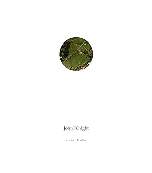
Soft cover. Condición: New. No Jacket. 1st Edition. John Knight Cabinet London 2013 Texts by Ray Mckenzie and Pedro de Llano Soft cover 20cm x 23 cm, 25pp 14 colour and 26 b&w plates Layout and typesetting in Bembo Translation Martin Dale Printed by Donahue Printing , Los Angeles Design JBMT Edition of 1000 copies This catalogue has been printed in relation to the exhibition Quiet Quality, which took took place in two sites, Cabinet Gallery London London 10 October 17 November 2012 and the Frieze Art Fair London 11 14 October 2012 The format of the book is consistent with the open ended series which the artist initiated in 1986, and of which to date approximately ten have been published. They are in many ways conspicuously all the same. Nine-by-eight-inch, staple bound, with white covers bearing the title of whatever project they encapsulate and typically featuring a die-cut hole as their cover design, which reveals an image beneath. The inside covers are printed with a repeating logo pattern, which also refers specifically to the hosting institution or to another aspect of the project. The internal structure, too, is consistent. The font used is Times Roman or more recently Bembo, and the content is organized into a title page, a list of acknowledgments often in reverse alphabetical order (Z-A), an introductory text, and one or more critical essays on your work accompanying reproductions of both past and current projects. At the end is a very short biography listing only the year or city of your birth (1945, Los Angeles or Hollywood) and where you are currently residing. Then, conspicuously, you never list your exhibition history, but instead offer a "Selected Bibliography" of articles and essays about your work. Seeing any one of these catalogs on its own, the design is innocuous enough that all these particularities recede beneath the informative capability of the catalog, but after twenty-plus years, this consistency is quite striking. Anyone even remotely familiar with your working methods can assume that this repetition of uniformity is anything but arbitrary. Jay Sanders. From a conversation with the artist entitled Jay Sanders Reads John Knight originally published in Parkett 86 2009, and included in October Files 16. All books are sent signed and tracked.
